-
Morning News: April 26, 2024
Posted by Eddy Elfenbein on April 26th, 2024 at 7:04 amNigeria Plans a $10 Billion Diaspora Fund to Attract Dollar Inflows
Xi Warns Blinken Against ‘Vicious Competition’ Between US, China
Bank of Japan Holds Rates Steady, Expects Inflation to Stay Around 2%
Yen Swings With Traders on High Alert for Intervention
U.K. Consumers Get Spring in Step as Confidence Mounts
Global Equity Funds Face Fourth Week of Outflows Amid Dampened Fed Rate Cut Hopes
Investors Brace for 5% Treasury Yields as US Inflation Worries Mount
With Inflation This High, Nobody Knows What a Dollar Is Worth
Only Half of Global Rate Hikes Set to Be Taken Back by End-2025
Billionaire Stephen Ross Believes in South Florida—and Is Spending Big to Transform It
What Is a ‘Decent Wage’? France’s Michelin Raises a Debate
‘Net Neutrality’ Faces a Stiff Judicial Test
Why Are Shares of Intel Stock Crashing After Earnings?
A Chinese Firm Is America’s Favorite Drone Maker. Except in Washington
Rosenbush’s Take: Rubrik IPO Reflects Increasingly Difficult Path Startups Face to Going Public
Thoma Bravo to Buy U.K. AI Cybersecurity Company Darktrace for $5.3 Billion
Air Conditioning and AI Are Demanding More of the World’s Power—Renewables Can’t Keep Up
Apollo Global to Buy U.S. Silica in $1.85 Billion Deal
Anglo Rejects BHP Takeover Bid as Significantly Undervalued
Rising Copper Demand Spurs Search for Alternative Climate Solutions
Bonjour, New York? French Oil CEO Sees a Climate Path Out of Paris
Exxon, Chevron Fall After Disappointing First-Quarter Showings
Railroad CEO Isn’t Ruthless Enough for Investors After Toxic Crash
China to Pay Consumers Up to Nearly $1,400 to Replace Old Cars
Regulators Probing Tesla Recall Tied to Autopilot
Used-Car Sales Have Moved Online—Here’s Why Both Customers and Dealers Are Happy
Americans Went All-In on Self-Storage. That Demand Is Suddenly Cooling
The Long, Slow Death of Urban Nightlife
Be sure to follow me on Twitter.
-
Morning News: April 25, 2024
Posted by Eddy Elfenbein on April 25th, 2024 at 7:05 amHow North Korea’s Man in the West Ran Afoul of US Authorities
South Korea’s Economy Posts Stronger-Than-Expected Growth
Blinken Raises US Concerns on Unfair Trade Practices in China
Ukraine Cuts Interest Rate Again After Securing Vital US Aid
How to Get a Meeting With the UAE’s $1.5 Trillion Man
BHP Makes $39 Billion Anglo Approach to Create Mining Giant
BHP Bid for Anglo American Set to Unleash Wave of Mining M&A
COP29 Climate Summit Countdown Starts With Finance at Forefront
German Consumer Confidence Reaches Two-Year High
America’s Economy Is No. 1. That Means Trouble
Lutnick Lands Wall Street Giants for His Futures Fight With CME
Goldman Sachs, BofA Shareholders Reject Proposals for CEO-Chair Split
Workers Are Celebrating a Ban on Noncompetes. Employers Are Ready to Fight
US White-Collar Job Growth Stalls, Even in Pandemic Boomtowns
Housing Will Get More Expensive Because of the Fed
‘To the Future’: Saudi Arabia Spends Big to Become an A.I. Superpower
Caught Between the US and China, a Powerful AI Upstart Chooses Sides
Zuckerberg Asks for Patience as Meta’s AI Push Spooks Investors
Microsoft, Alphabet Face a ‘Show Me’ Moment After Meta Misfire
Oracle’s Jump to Nashville Surprises Austin
LG Electronics Posts Profit Turnaround on Steady Revenue Growth
Room & Board Sets Up Employee Stock Ownership Plan, Giving Workers A Stake
American Airlines Sees Better-Than-Expected Profit This Quarter
Southwest Air Slows Growth as Boeing Trims Jet Deliveries
What Marketers Should Know About Ibotta, the Digital Promotions Company That Just Went Public
McKinsey Is Under Criminal Investigation for Its Opioid Work
With New Salt and Sugar Limits, School Cafeterias Are ‘Cringing’
What Do Weight Loss Drugs Mean for a Diet Industry Built on Eating Less and Exercising More?
Spanish Beauty Billionaires Seek IPO to Ward Off Succession Drama
How a Pirate-Clad Pastor Helped Ignite Trump Media’s Market Frenzy
Be sure to follow me on Twitter.
-
Morning News: April 24, 2024
Posted by Eddy Elfenbein on April 24th, 2024 at 7:07 amClimate Change Poses a Child Labor ‘Threat Multiplier’
Xi’s Armada Is Winning the Battle for Energy in the South China Sea
One of Europe’s Fastest-Growing Energy Companies Wants a Slice of the U.S. Offshore Wind Market
Gulf States Learn the Power and Limits of Petrodollar Persuasion
Chevron-Exxon Faceoff Hinges on Growth Ambitions
China Inc.’s Backers Are Brushing Off Trump Tariff Threats
China Central Bank Remarks Suggest Bond-Trading Liquidity Boost Not Imminent
Indonesia Central Bank Delivers Surprise Rate Hike as Rupiah Tumbles
High Borrowing Costs Have Some Democrats Urging Biden to Pressure the Fed
Russia Pushes Its Largest Private Bank to Redomicile at Home
UBS Flags ‘Serious’ Concern About New Swiss Capital Requirements
Jamie Dimon Has a Rival in Tech: Silicon Valley Bank
US Seeks 36 Months’ Jail for Binance Founder Zhao
US 30-Year Mortgage Rate Rises to Five-Month High of 7.24%
Florida’s Home Insurance Industry May Be Worse Than Anyone Realizes
TikTok Ban Looms With Biden Poised to Start 270-Day Countdown
Who Stands to Gain from a TikTok Ban
Meta’s A.I. Assistant Is Fun to Use, but It Can’t Be Trusted
Microsoft, Amazon AI Deals Get Deeper UK Antitrust Scrutiny
New Ban on Noncompetes Could Have Big Impact on Health Care
Pharma Startup Uses AI to Test Old Drugs to Treat Rare Diseases
Oracle is Moving Its World Headquarters to Nashville to Be Closer to Health-Care Industry
Airlines Must Now Pay Automatic Refunds for Canceled Flights
Wanted: An Executive to Repair Boeing
Boeing’s $3.9 Billion Cash Burn Adds Urgency to Revival Plan
China’s EV Price War Is Just Getting Started
Tesla Speeds Cheaper EV Plans, Calming Fears Over Strategy
Unilever India Misses Profit Estimate on Sluggish Demand
Prada Posts Higher Revenue Despite Luxury Slowdown
Kering’s Shares Fall on Lower Profitability Outlook
Studio Behind Dune Eyes Growth, Even Without a Paramount Merger
Be sure to follow me on Twitter.
-
CWS Market Review – April 23, 2024
Posted by Eddy Elfenbein on April 23rd, 2024 at 8:21 pm(This is the free version of CWS Market Review. If you like what you see, then please sign up for the premium newsletter for $20 per month or $200 for the whole year. If you sign up today, you can see our two reports, “Your Handy Guide to Stock Orders” and “How Not to Get Screwed on Your Mortgage.”)
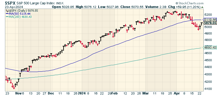
On Monday, the S&P 500 snapped a six-day losing streak. That was the market’s longest losing streak since Covid wrecked the markets four years ago. The S&P 500 closed today at its highest level in 11 days.
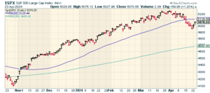
Ryan Detrick points out that the S&P 500 had a maximum drawdown of 5.5% this year, and historically, that’s small. Since 1980, the average maximum drawdown in a year is 14.2%. In other words, in a perfectly average year, you can expect the stock market, at some point, to be more than 14% off its high.
Tech stocks were particularly strong today, as were many industrials. The Russell 2000 Index of small caps also had a good day. That index tends to skew to domestic manufacturers. The Russell 2000 has led the broader market for the last four days in a row.
The stock market had a decent rebound yesterday and today. In fact, this was the largest two-day gain in two months, but I don’t think we’re in the clear just yet. The Federal Reserve continues to be stubborn about lowering interest rates. We may have to wait until September to get our first rate cut. After that, there may not be another rate cut until 2025. It’s hard to say for now because the outlook is very unclear.
Q1 Earnings Are Looking Weak
What is clear is that this earnings season is, so far, on the weak side. Q1 earnings growth is currently tracking at 0.43%. That’s down from 3.32% one month ago. Of those that have reported so far, 77.1% of companies have beaten their earnings estimates while 60% have beaten on revenues. Slightly more than half (52.9%) have beaten on both.
For the quarter, Wall Street expects the S&P 500 to earn $52.94 per share. That’s the index-adjusted number. For the entire year, analysts expect the S&P 500 to earn $239.66 per share. That would be an increase of 9.19% over last year. That translates to a forward price/earnings ratio of 21. That’s a bit rich, but it could probably be justified if Q2 and Q3 earnings prove to be good.
Earnings season is when the good stocks are rewarded and when the bad ones get punished. Globe Life (GL), a former Buy List stock, soared 11% after it reported reassuring earnings. The stock was clobbered after it was hit by short sellers. Shorting is a tough game. A successful short can make a lot in a short amount of time, but if you’re wrong, you can get squeezed out of your position.
Shares of General Motors (GM) rallied after the company beat earnings ($2.62 vs. $2.15) and guided higher. Tesla (TSLA) reported after today’s closing bell and the numbers weren’t so good. For Q1, Tesla earned 45 cents per share which was six cents less than estimates. Tesla had quarterly revenues of $21.3 billion which was $850 million below estimates. Shares of Tesla climbed 7% in the after-hours market but I suspect that was only a reaction to its poor performance in recent days.
Tesla isn’t alone. JetBlue (JBLU) dropped more than 19% after it lowered its revenue forecast. The airline has been slashing costs recently. Earlier this year, a judge blocked JetBlue’s $3.8 billion attempt to merge with Spirit Airlines.
Pepsi (PEP) which is a conservative stock, did not please traders. The company beat earnings ($1.61 vs. $1.52) and beat on revenues, but its Quaker Foods division performed poorly. The soda company lost 3% today.
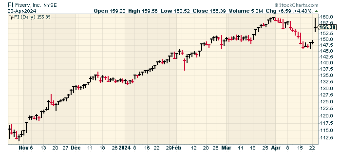
Fiserv Rallies on Earnings Beat
On our Buy List, I was pleased to see Fiserv (FI) report very good results. Fiserv has been a member of our Buy List since the very beginning, 19 years ago.
I’ll have more details in our premium issue, but I wanted share some of the highlights of Fiserv’s quarter. For Q1, organic revenue rose 20% and earnings increased 19% to $1.88 per share. That was nine cents higher than Wall Street’s forecast. During the quarter, Fiserv bought back 10.2 million shares for $1.5 billion.
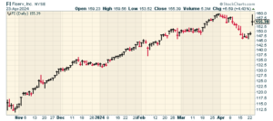
The company also raised its earnings guidance for this year from a range of $8.55 to $8.70 per share, to $8.60 to $8.75 per share. Fiserv continues to expect organic revenue growth of 15% to 17% this year.
“Fiserv remains committed to our virtuous cycle of investment, revenue growth, operating leverage, capital return and re-investment for further growth, reinforced with a focus on clients, operational excellence, and a strong balance sheet,” said Bisignano. “This proven model, along with our strong first quarter results, led us to raise our 2024 adjusted earnings per share outlook for the full year.”
Shares of Fiserv rallied 4.4% during today’s trading. At one point, FI was up over 7% today. Over the last six months, Fiserv is a 42% winner for us.
Here’s Fiserv’s CEO on CNBC earlier today:
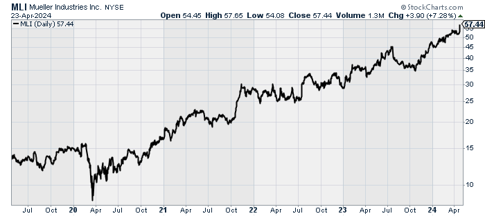
Mueller Industries Has Become a Big Winner
Three years ago, I profiled Mueller Industries (MLI). The company is a leading manufacturer of copper, brass, aluminum and plastic products. This is a classic small-cap cyclical stock. Once you realize the scope of their business, you understand that the use of Mueller’s products is seemingly endless. Mueller makes everything from copper tubing and fittings to brass and copper alloy bars and refrigeration valves.
You can find Mueller most anywhere. Some of the companies that rely on Mueller are in sectors like plumbing, heating, air conditioning, refrigeration, appliance, medical, automotive, military and defense, marine and recreational. Mueller’s operations are located throughout the United States and in Canada, Mexico, Great Britain, South Korea, and China.
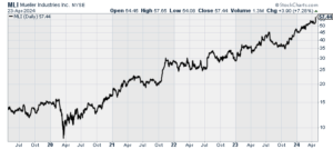
Best of all, Mueller is completely ignored by Wall Street. I used to say that no Wall Street analyst follows Mueller, but that’s no longer correct. It’s picked up one analyst. Tesla, in contrast, is followed by 36 analysts.
I wrote “Keep an eye on Mueller. This could be a big winner in the months ahead.” I should have listened to myself! Since then, shares of MLI are up 140%.
This morning, Mueller reported Q1 earnings of $1.38 per share, and the stock gained over 7% in today’s trading. Not bad for a brass company that no one follows.
While this week will be dominated by earnings news, I’ll be looking out for Thursday’s report on Q1 GDP. This could be the third strong report in a row. Right now, Wall Street expects Q1 GDP growth of 2.2% (that’s annualized and adjusted for inflation. The Atlanta Fed’s GDPNow model expects growth of 2.9% which would be quite good.
The day after the GDP, the government will release the PCE price data which is what the Federal Reserve prefers to follow for inflation. For March, Wall Street expects that both headline and core PCE increased by 0.2%. If the number comes in soft, that could revive hopes of the Fed cutting rates sooner rather than after Labor Day.
That’s all for now. I’ll have more for you in the next issue of CWS Market Review.
– Eddy
P.S. I was recently on Jim O’Shaughnessy’s “Infinite Loops” podcast. Jim is one of my favorite people, and I had a lot of fun. You can listen to the full episode here.
-
Morning News: April 23, 2024
Posted by Eddy Elfenbein on April 23rd, 2024 at 7:04 amDonors Stay Largely Silent Amid New Wave of Campus Protests
Oil Is Shedding Its Mideast Fear Premium Too Fast
Panama’s Rainy Season Signals Relief at Canal Bottleneck
Baltimore Says Owner of Ship that Hit Key Bridge Was Negligent
Bolivia’s Boom Has Turned to Bust, Fueling an Unlikely Presidential Comeback Bid
Russia Threatens to Intensify Strikes on Ukraine Over US Aid
BOJ’s Ueda Reiterates Possibility of Rate Hike if Inflation Rises as Expected
BOE Chief Economist Pill Says Key Rate Cut Is Some Way Off
Eurozone Growth Gap With U.S. Points to Central-Bank Divergence
ECB Will Consider Fed’s Progress When Deciding on Rate Cuts, De Guindos Says
Love That Strong Dollar. It May Not Last
A Hedge Fund Billionaire’s Cash Helped Fund a ‘Predatory’ Lender
In Silicon Valley, You Can Be Worth Billions and It’s Not Enough
‘Pay Later’ Lenders Have an Issue With Credit Bureaus
Inside Palantir’s AI Sales Secret Weapon: Software Boot Camp
Apple’s China iPhone Sales Dive 19% in Worst Quarter Since 2020
Tesla Stock in ‘No Man’s Land’ After 43% Rout Ahead of Earnings
GM Raises Profit Outlook for 2024 After Strong First-Quarter Earnings
Volkswagen Holds Keys to Porsche’s Race Against Ferrari
Jetblue Shares Tumble 10% After Airline Lowers 2024 Revenue Outlook
Trump Set for Another $1.3 Billion in Shares He Can’t Sell Yet
Spotify Swings to Profit Amid Boost in Paid Subscribers
Starbucks Leads Business Opposition to Pro-Worker Labor Board
Chinese Bubble Tea Maker Slides in Hong Kong’s Largest Listing This Year
F.T.C. Sues to Block $8.5 Billion Fashion Merger
Billionaire Pinaults Fight to Pull Gucci Off the Discount Rack
JD Sports Steps Up U.S. Push With $1.1 Billion Deal for Retailer Hibbett
Be sure to follow me on Twitter.
-
Morning News: April 22, 2024
Posted by Eddy Elfenbein on April 22nd, 2024 at 7:03 amChina’s Benchmark Lending Rates Kept Unchanged
US Dollar’s Extended Reign Delivers Stark Wake-Up Call for Markets
‘Overdue’ Pullback in US Stocks to Test Dip-Buyers’ Resolve
Why the Stock Market Is Having ‘Digestion Problems’ This Earnings Season
US Bond Bulls Lean Into Latest Selloff Despite Inflation Scare
Path for 10-Year U.S. Treasury Yield to 5% Is Possible but Tricky
US Consumers on Lower Incomes Face Loan Stress While Banks Pull Back
Ray Dalio’s Famous Trade Is Sputtering and Investors Are Bailing
Souring China Dreams Force Western Financial Firms to Cut Costs
How JPMorgan’s Cash Call Beat Bank of America
Offshore Drilling Grows as US Shale Gets Left Behind
US Commerce Chief Goes Prime Time Defending Industrial Policy
Raimondo Says Huawei’s Chip Breakthrough Is Years Behind US Tech
TikTok Braces for US Divest-or-Ban Law — And a Legal Fight
Tesla, Li Auto Cut Prices as China’s EV Price War Heats Up
Elon Musk’s Robotaxi Dreams Plunge Tesla Into Chaos
How Can Elon Musk Reassure Tesla Investors?
Nissan Motor Shares Drop After Annual Profit Estimate Lowered on Slower Sales
VW Works Closely With Unions in Germany, but UAW May Be Less Cuddly
Walmart’s Tiny Tag Revolution Is Promising a Productivity Boost
Apple iPhone Trade-Ins Aren’t the Green Solution Consumers Expect
Verizon Reports Profit Beat and Rise in Wireless Subscribers
Bird Flu Is Infecting More Mammals. What Does That Mean for Us?
Is Online Shopping Bad for the Planet?
The Chinese Site That Rewired Online Shopping
Levi Strauss Is Stretching Beyond Wholesale in Search for New Customers
China’s Bubble Tea Boom Creates a Half-Dozen Billionaires
How a Massive Hack of Psychotherapy Records Revealed a Nation’s Secrets
Tomb Raider Owner Embracer Plans Three-Way Split
Be sure to follow me on Twitter.
-
Morning News: April 19, 2024
Posted by Eddy Elfenbein on April 19th, 2024 at 7:02 amJapan Inflation Records Two Years Above BOJ’s Target as Meeting Looms
Oil Tests Central Bankers’ Nerves With Mideast on ‘Knife Edge’
Another Shock From the Middle East for Markets
Are Rates High Enough? Fed Resets Clock on Interest-Rate Cuts
Global Equity Funds See Surge in Outflows as Rate Cut Hopes Fade
PwC Looks to Shrink New U.S. Consulting Partner Class by More Than 50%
What to Do When Your 401(k) Leaves Something to Be Desired
Crypto Fans Count Down to Bitcoin’s ‘Halving’
Crypto Fund Cautions That Record Quarter Is ‘Not a New Normal’
How a Crypto Compliance Officer Ended Up in a Nigerian Prison
Housing Market Slumps as Mortgage Rates Top 7%
New York’s Rich Get Creative to Flee State Taxes. Auditors Are On to Them
Cracking Down on Sim Card Scams Is No Easy Task
Apple Says It Was Ordered to Pull WhatsApp From China App Store
Love, Hate or Fear It, TikTok Has Changed America
Google Worker Says the Company Is ‘Silencing Our Voices’ After Mass Firings
Nissan Motor Cuts Annual Profit Estimate on Lower Vehicle Sales
Tesla to Recall 3,878 Cybertrucks Due to Accelerator Pedal Problem
P&G Raises Profit Outlook as Higher Prices Bolster Bottom Line
America’s Cigarette Market Is Up for Grabs
Walmart-Backed Ibotta Rises 17% After $577 Million IPO
Redstone’s Deal Dilemma: Give Paramount Investors a Vote or Not?
Netflix Adds 9.33 Million Customers, Says Gains Will Slow
Netflix Dealt With the Freeloaders. Its Next Act Will Be Tougher
‘Going Against the Mouse’: Disneyland Performers Advance Unionization Efforts
Brazil’s Afrotourism Push Is Better Late Than Never
Be sure to follow me on Twitter.
-
Morning News: April 18, 2024
Posted by Eddy Elfenbein on April 18th, 2024 at 7:02 amThe Pentagon Wants to Give Defense Startups a Chance
The White House Has a New Trade Weapon Against China
Basel Chair Urges Banks to Fully Implement Capital Rules as Soon as Possible
New Fed Outlook Leaves World Edgy on Currencies
Vanguard Warns 10-Year Treasury Yields Risk Jump Back to 5%
Blackstone Credit and Retail Lines Drive Narrow Profit Beat
Ally Financial’s Quarterly Profit Tumbles on Higher Provisions
Companies Belly Up to Cash Buffet, in Five Charts
Private Equity’s Titans Are Told to Cough Up Their Own Cash
Billionaires Selling Cheap Stuff Get Richer From Inflation Pain
China Reports Steady Youth Unemployment as Data Paints Mixed Economic Picture
Congress Ramps Up the Pressure on TikTok
How an Obscure Chinese Real Estate Start-Up Paved the Way to TikTok
EU March Car Sales Recorded Biggest Drop in 16 Months
For Tesla, India Represents Big Promise—and Some Peril
Musk Apologizes for ‘Incorrectly Low’ Tesla Severance Packages
Nvidia, Chip Stocks Drop Into Correction as Rate Bets Shift
Morgan Stanley Flips From EBay’s Biggest Bear to Top Bull on AI
Copper Market Grapples With a Crucial Question
What Really Happens When You Trade In an iPhone at the Apple Store
EasyJet Expects Narrower Loss Amid Strong Summer Demand
Taking Account of Rising Health Care Costs
Ozempic ‘Oops’ Babies Spark Debate About Weight-Loss Shot Use as Fertility Drugs
Why the World of Chocolate Is in Crisis
Be sure to follow me on Twitter.
-
Morning News: April 17, 2024
Posted by Eddy Elfenbein on April 17th, 2024 at 7:07 amFor Multinationals, Africa’s Allure Is Fading
Aging Copper Mines Are Turning Into Money Pits Despite Demand
Biden Seeks Higher Tariffs on Chinese Steel, Aluminum to Support US Firms
Biden Confronts Tough Choice Over Venezuela Oil Sanctions
NBA Legend Rick Fox’s Next Act: Green Concrete Entrepreneur
BlackRock’s Aggressive Hunt for Growth in Saudi Arabia
Singapore Exports Slump More Than Expected
Japan’s Exports Extend Run of Growth to Fourth Straight Month
World Faces Woeful Outlook of Stunted Potential
The Global Turn Away From Free-Market Policies Worries Economists
Inflation in U.K. Slows to 3.2%, Lowest in More Than 2 Years
Where Are Growth, Inflation and Interest Rates Headed? We Asked the Economists
Higher-for-Longer Is Pushing Dollar Power to Limit
If Index Funds Were Politically Motivated, They Wouldn’t Be Index Funds
U.S. Bancorp Trims Lending-Income Outlook Amid Deposit Pressures
Bankers Hit With Millions in Breakup Fees for Ditching New Jobs
Layoff Whiplash Scars Workers Who Find New Jobs Only to Lose Them
Volkswagen Aims for Lower EV Costs With New Production Platform in China
VW Workers in Tennessee Start Vote on U.A.W., Testing Union Ambitions
Tesla Asks Investors to Approve Musk’s $56 Billion Pay Again
Singapore’s Steep Car Prices Propel SoftBank’s Unicorn Carro Toward IPO
ASML Orders Plunge as Chipmakers Pause High-End Gear Purchases
Microsoft’s AI Copilot Is Starting to Automate the Coding Industry
Aerospace Parts Manufacturer Loar Holdings Aims Up to $2.28 Billion Valuation in US IPO
Boeing’s Quality Complaints Mount as Another Whistleblower Comes Forward
From NPR to NBC, Newsrooms Test Management’s Tolerance for Dissent
The Paris Olympics’ One Sure Thing: Cyberattacks
Taylor Swift and Beyoncé Avoided a Collision on the Charts. (Again.)
Taylor Swift Sells a Rainbow of Vinyl Albums. Fans Keep Buying Them
Superyacht Sales Plunge as Wait Times Rise, Russian Oligarchs Drop Out of the Market
Be sure to follow me on Twitter.
-
CWS Market Review – April 16, 2024
Posted by Eddy Elfenbein on April 16th, 2024 at 6:23 pm(This is the free version of CWS Market Review. If you like what you see, then please sign up for the premium newsletter for $20 per month or $200 for the whole year. If you sign up today, you can see our two reports, “Your Handy Guide to Stock Orders” and “How Not to Get Screwed on Your Mortgage.”)
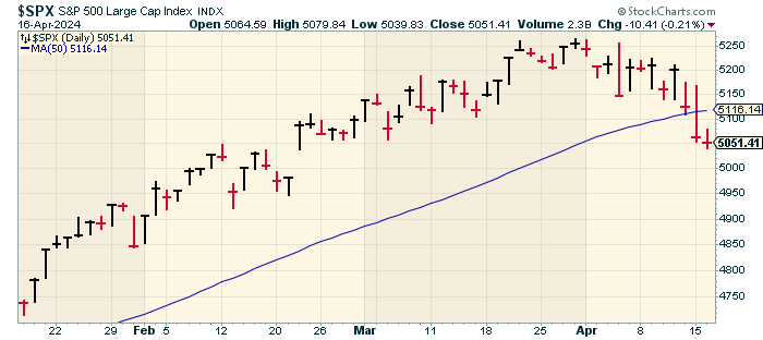
The stock market is finally showing some cracks. Yesterday, the Dow soared more than 400 points during the day only to close lower by 248 points. The S&P 500 slipped another 0.21% today. The index finished the day at its lowest level since February 21.
On Monday, the S&P 500 also closed below its 50-day moving average (the blue line). That snapped a streak of 110 days, which is one of the longest such streaks in the last 30 years. (In the mid-1990s, the S&P 500 was trading above its 50-DMA for more than a year.)
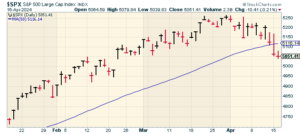
Dropping below the 50-DMA can be an omen for a poor or a sluggish market. Not only is Wall Street still rattled by last week’s inflation report but the escalating tensions in the Middle East are also weighing on investors.
To be frank, the recent stock market hasn’t been that volatile. The VIX, which is the volatility index, rose from less than 15 on Thursday to more than 19.5 during the day on Tuesday. It’s just that the previous five months have been unusually calm, so any change from that pattern seems unusually jarring.
We’ve gotten our first batch of Q1 earnings reports. Bank of America (BAC) said its earnings dropped 18%, and it missed estimates by one penny per share. Johnson & Johnson (JNJ) beat by seven cents per share, but the stock hit a new 52-week low. Goldman Sachs (GS) had a strong quarter as its profits rose 28%. Trump Media (DJT) lost 39% in the last week.
A few weeks ago, I mentioned how defensive stocks had been particularly weak. Today was a good example of defensive stocks doing well. In particular, staples and healthcare stocks were up the most, or in many cases, down the least.
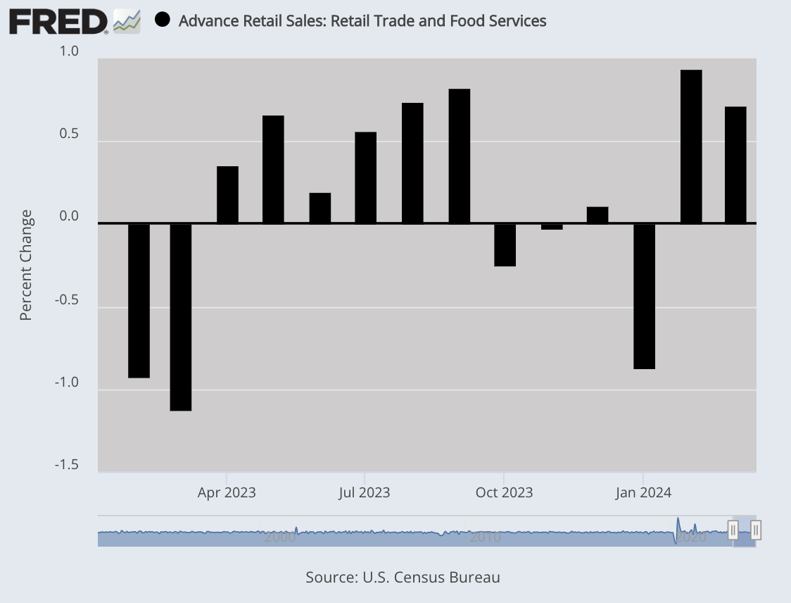
Retail Sales Jump 0.7%
The economic news continues to be favorable. Shoppers are in a buying mood. On Monday, the Commerce Department said that retail sales rose by 0.7% last month.
That was a pleasant surprise. Wall Street had been expecting a gain of only 0.3%. Also, the number for February was revised higher to a gain of 0.9%.
This tells us that despite stubborn inflation, higher prices haven’t kept shoppers from the malls. Over the last year, retail sales increased by 4% while inflation was up by 3.5%.

If we don’t count cars, then retail sales increased by 1.1% last month. That more than doubled Wall Street’s estimates for a gain of 0.5%. It’s true that higher gasoline prices helped drive higher retail sales, but the largest increase came from online sales, which were up by 2.7%. These numbers are important to watch because consumers make up about 70% of the economy.
The Atlanta Fed’s GDP model increased its estimate for Q1 GDP growth from 2.4% to 2.9%. The model now expects real personal consumption expenditures (PCE) to rise by 3.5%. That’s quite good. The government’s initial report on Q1 GDP growth will be out on April 25. The initial report will be updated two more times.
On Tuesday, the Federal Reserve said that industrial production increased by 0.4% last month. That’s good to see because this data series hasn’t done much over the past two years. Last month, manufacturing increased by 0.5%. If we don’t count autos, then factory output was up by 0.3%.
Thanks to the positive economic news, that’s altering the markets’ take on the Fed and the course for interest rates. According to the most recent trading in the futures market, there’s a 65% chance that the Fed’s first rate cut will come in September, and there’s a 51% chance that it will be the Fed’s only rate cut this year.
Earlier today, Fed Chair Jerome Powell conceded that there’s been “a lack of further progress” with regard to inflation. Powell indicated that rate cuts may not be coming so soon. This is a noticeable change from the Fed’s stance of only a few weeks ago.
One effect of higher interest rates is that the US dollar has been getting stronger in recent days. The dollar is also being helped by increased international tensions. When investors get nervous, they go to areas of stability. According to Bloomberg, the greenback is having its best run in over a year.
Until now, investors had assumed that most of the world’s major central banks would cut rates similarly, so therefore, the impact would be negligible. Now that doesn’t appear to be the case.
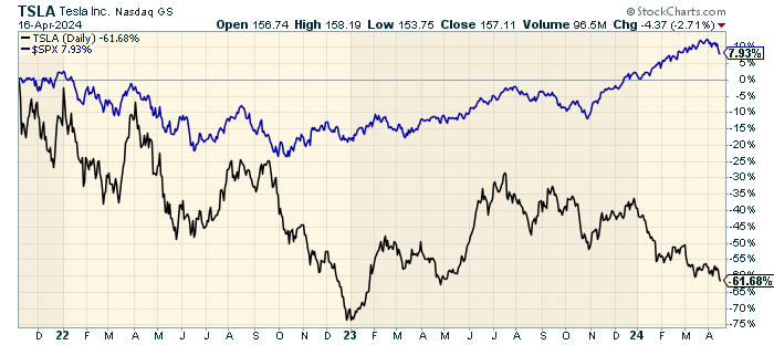
Tesla to Cut 10% of its Workforce
Something on Wall Street that still surprises me is how quickly a stock can go, in Wall Street’s eyes, from doing nothing wrong to doing nothing right.
I say this in the wake of Monday’s news that Tesla (TSLA) will be laying off more than 10% of its global workforce. The electric vehicle leader is facing the reality of slower sales growth. In Q1, Tesla delivered 387,000 vehicles. That’s down 8.5% from last year.
Companies like Tesla are always a challenge for value-oriented investors because embryonic industries are often long on potential but meager with results. How can an investor properly value a stock that’s trading at 100 times trailing earnings but that could be the next Microsoft (MSFT)? It’s a tough question, and I don’t know the answer. I will concede that non-traditional companies should be valued in non-traditional ways.
That’s certainly true for Tesla, but now we’re talking about a company that’s richly valued but may not be growing so quickly. Tesla’s profit margins have consistently eroded. Tesla has also experienced several senior executives leaving the company.
Elon Musk said, “About every 5 years, we need to reorganize and streamline the company for the next phase of growth.” The last time they cut 10% of the workforce was two years ago.
You can see how badly Tesla has lagged the overall market.
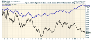
Musk is apparently pushing the company hard in the direction of fully-autonomous vehicles. The goal is to unveil a robotaxi sometime this summer. Meanwhile, other car companies are scaling back their EV plans, while hybrid sales are as strong as ever.
These kinds of stocks are often referred to as lottery investments meaning that investors know that 90% of these investments will go nowhere but that a big home run will more than make up for the losses.
Let’s say that forty years ago, you decided that computers were the future. You decided to invest in what most experts believed were the top contenders in the field. That probably would have led you to invest in IBM, Cray and DEC. Lancaster Colony (LANC) would have been a far better investment. They make croutons.
My point is that even if you’re right in your thesis, you can be wrong in your delivery.
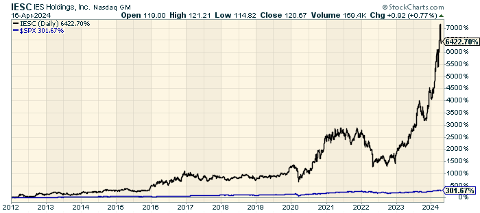
Stock Focus: IES Holdings (IESC)
As long-time readers know, one of my favorite hobbies is to highlight high-quality companies that are practically unfollowed by Wall Street. I’m often asked how to find these stocks, but that’s hard to answer because they’re, by definition, not well known.
Recently, I came across IES Holdings (IESC), which I have to confess I was unfamiliar with. I’m glad I know it now. Twelve years ago, it was going for $1.75 per share. Now it’s at $120. Still, not a single analyst covers it.
IESC has done so well that the S&P 500 looks like a flat line in comparison.
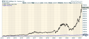
According to Wikipedia, IESC “provides infrastructure services including electrical, communications, low-voltage, network, AV, and security alarm systems to the residential, industrial and commercial markets.”
IESC isn’t some microcap. The company has 8,300 employees and a market value of $2.4 billion. The company was founded in 1997 and it’s based in Houston.
For the most recent fiscal year (ending in September), IESC made $4.71 per share. IESC’s next earnings report will probably be out in early May, but I can’t say what Wall Street’s consensus is since there isn’t one.
That’s all for now. I’ll have more for you in the next issue of CWS Market Review.
– Eddy
P.S. If you want more info on our ETF, you can check out the ETF’s website.
- Tweets by @EddyElfenbein
-
-
Archives
- April 2024
- March 2024
- February 2024
- January 2024
- December 2023
- November 2023
- October 2023
- September 2023
- August 2023
- July 2023
- June 2023
- May 2023
- April 2023
- March 2023
- February 2023
- January 2023
- December 2022
- November 2022
- October 2022
- September 2022
- August 2022
- July 2022
- June 2022
- May 2022
- April 2022
- March 2022
- February 2022
- January 2022
- December 2021
- November 2021
- October 2021
- September 2021
- August 2021
- July 2021
- June 2021
- May 2021
- April 2021
- March 2021
- February 2021
- January 2021
- December 2020
- November 2020
- October 2020
- September 2020
- August 2020
- July 2020
- June 2020
- May 2020
- April 2020
- March 2020
- February 2020
- January 2020
- December 2019
- November 2019
- October 2019
- September 2019
- August 2019
- July 2019
- June 2019
- May 2019
- April 2019
- March 2019
- February 2019
- January 2019
- December 2018
- November 2018
- October 2018
- September 2018
- August 2018
- July 2018
- June 2018
- May 2018
- April 2018
- March 2018
- February 2018
- January 2018
- December 2017
- November 2017
- October 2017
- September 2017
- August 2017
- July 2017
- June 2017
- May 2017
- April 2017
- March 2017
- February 2017
- January 2017
- December 2016
- November 2016
- October 2016
- September 2016
- August 2016
- July 2016
- June 2016
- May 2016
- April 2016
- March 2016
- February 2016
- January 2016
- December 2015
- November 2015
- October 2015
- September 2015
- August 2015
- July 2015
- June 2015
- May 2015
- April 2015
- March 2015
- February 2015
- January 2015
- December 2014
- November 2014
- October 2014
- September 2014
- August 2014
- July 2014
- June 2014
- May 2014
- April 2014
- March 2014
- February 2014
- January 2014
- December 2013
- November 2013
- October 2013
- September 2013
- August 2013
- July 2013
- June 2013
- May 2013
- April 2013
- March 2013
- February 2013
- January 2013
- December 2012
- November 2012
- October 2012
- September 2012
- August 2012
- July 2012
- June 2012
- May 2012
- April 2012
- March 2012
- February 2012
- January 2012
- December 2011
- November 2011
- October 2011
- September 2011
- August 2011
- July 2011
- June 2011
- May 2011
- April 2011
- March 2011
- February 2011
- January 2011
- December 2010
- November 2010
- October 2010
- September 2010
- August 2010
- July 2010
- June 2010
- May 2010
- April 2010
- March 2010
- February 2010
- January 2010
- December 2009
- November 2009
- October 2009
- September 2009
- August 2009
- July 2009
- June 2009
- May 2009
- April 2009
- March 2009
- February 2009
- January 2009
- December 2008
- November 2008
- October 2008
- September 2008
- August 2008
- July 2008
- June 2008
- May 2008
- April 2008
- March 2008
- February 2008
- January 2008
- December 2007
- November 2007
- October 2007
- September 2007
- August 2007
- July 2007
- June 2007
- May 2007
- April 2007
- March 2007
- February 2007
- January 2007
- December 2006
- November 2006
- October 2006
- September 2006
- August 2006
- July 2006
- June 2006
- May 2006
- April 2006
- March 2006
- February 2006
- January 2006
- December 2005
- November 2005
- October 2005
- September 2005
- August 2005
- July 2005
 Eddy Elfenbein is a Washington, DC-based speaker, portfolio manager and editor of the blog Crossing Wall Street. His