The Power of Momentum
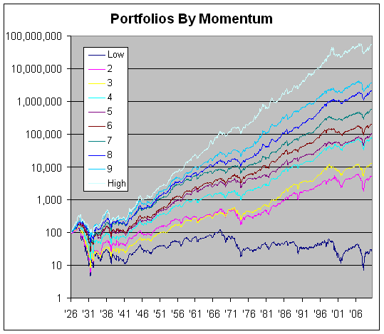
In a post yesterday, I criticized some sloppy analysis which tried to make overly broad statements based on long-term stock data. Here’s a good example of how long-term data ought to be used. The chart below shows the historical performance of stocks ranked by momentum decile (meaning 10% slices).
I took the numbers from Ken French’s data library. The reason why this is a more sound method is that we’re using long-term data to isolate one particular aspect of stock performance.
It turns out that stocks that are in motion have a very long record of continuing to stay in motion. Just to be clear, momentum is defined by performance over the 11-month period starting 12 months ago and ending one month ago. The month directly prior to each period is excluded. At the end of the month, the whole thing is repeated.
The deciles are perfectly ranked by momentum. The portfolio with the highest momentum did the best. The second-best came in second and so on, all the way down to the worst momentum which came in last.

 Eddy Elfenbein is a Washington, DC-based speaker, portfolio manager and editor of the blog Crossing Wall Street. His