-
Altria Raises Dividend
Posted by Eddy Elfenbein on August 27th, 2010 at 11:46 amAltria (MO) announced today that it’s increasing its quarterly dividend by 8.6% to 38 cents per share. Think of it this way: If you had bought the shares 25 years ago, the dividends alone are yielding you 192%.
-
Krugman and Bond 36,000
Posted by Eddy Elfenbein on August 27th, 2010 at 9:55 amTen years, I criticized the Dow 36,000 thesis for its bad math. Now I very cautiously criticize Paul Krugman’s defense of the bond bulls.
Professor Krugman had a post earlier this week saying that the low yield on the 10-year T-bond is justified. He backed up this claim by taking the CBO’s 10-year projections for unemployment and core inflation and ran that through Greg Mankiw’s Fed rate rule.
The output was a projection for the Fed funds rate for the next 10 years. What’s interesting is that it shows that the Fed ought to keep rates near 0% for a few more years.
The problem I have with Krugman is what he did next. He used the 10-year forecast of short-term rates to arrive at his estimate of what the 10-year yield ought to be—2.6%.
The problem with this is that the yield on the 10-year bond is not solely the summation of 10 one-year bonds, or 40 three-month bills, or whatever time slice you like to use. There’s also an added “term premium.” This is what makes the yield curve, well…curve.
I looked at the historic spread of the 10-year bond over the effective Fed funds rate since 1954 (chart below). The spread has average 92 basis points. Bear in mind that this is a premium that’s over and above what the market has already factored for future rate increases. This is simply the premium you get for holding longer term debt.
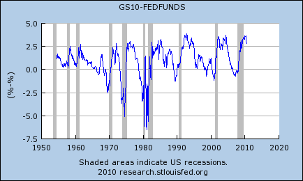
Assuming a 10-year bond with a coupon of 2.6%, an increase in yield of 92 basis points translates to a drop in price of close to 8%. That may not sound like a lot but it’s a big move in the bond market and it’s especially large if you’re pricing in an historic bull market for bonds.
This ends today’s portion of my day when I criticize Nobel Prize winners in their field. -
The Lost Decade
Posted by Eddy Elfenbein on August 27th, 2010 at 9:03 amThe government revised the GDP growth number for Q2 today and it wasn’t good. Instead of growing by 2.4% which the original report said, the economy grew by just 1.6% for the second three months of the year.
As bad as that sounds, Wall Street was expecting even worse. The consensus was to expect 1.3%. Thanks to that “good news,” it looks like stocks are ready to open higher.
The 1.6% growth rate also matches what the U.S. economy has done over the last ten years. There’s talk of us having a lost decade; we’ve already had one!
Here’s a look at the annualized GDP growth rate over the preceding 10 years:
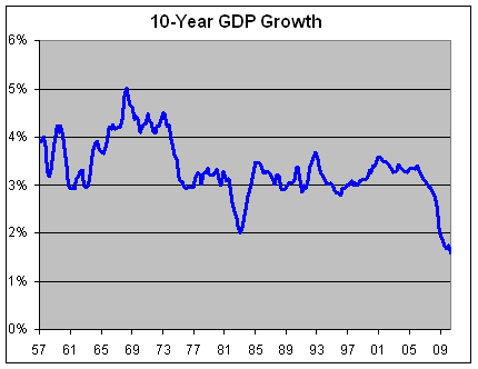
Since Q2 of 2000, the economy has averaged 1.6% a year which is less than half the growth rate of the preceding 10 years. -
The Low Point in the Presidential Election Cycle
Posted by Eddy Elfenbein on August 27th, 2010 at 6:30 amWe’re coming up on an important day for investors. One month from now is the market’s historic low point during the Presidential Election Cycle. Historically, September 30 of the mid-term year is the best time to buy stocks.
A few years ago, I crunched the entire history of the Dow from 1896 to 2007. Here’s what I found:
Historically, the Dow has gained an average of 24.1% from September 30 of the mid-term election year to September 6 of the pre-election year. This means that nearly two-thirds of the Dow’s four-year gain (24.1% of 36.7%) comes in less than one-quarter of the time. That’s a pretty stunning stat.
After September 6 of the pre-election year, the Dow has historically pulled back 5.2% to May 29 of the election year. After that, it puts on a nice 23.2% climb to August 3 of the post election year. Then trouble starts. After September 3, the Dow then pulls back 5.6% and we’re back at our starting point, September 30 of the mid-term election year.
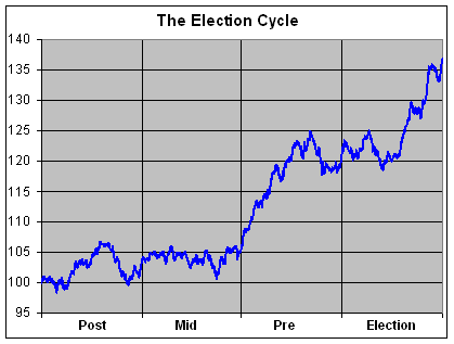
Warning: I don’t put much faith in this statistical oddities for gaining a trading advantage. I simply think they’re interesting in what they reveal about market history. -
Goldman Sachs January 2011 Puts
Posted by Eddy Elfenbein on August 26th, 2010 at 2:41 pmJust in case anyone is interested, you can pick up some puts on Goldman Sachs (GS) for January 2011 with a strike price of $2.50. You never know.
-
This Might be a Sell Signal
Posted by Eddy Elfenbein on August 26th, 2010 at 2:18 pmIf the CEO of one of your stocks is named Time’s Person of the Year, that might be time to sell. Intel‘s (INTC) Andrew Grove got that distinction in 1997 and the stock’s recent plunge brings it to almost exactly where it was back then. Intel is currently going for just 8.7 times next year’s earnings.
Jeff Bezos got the nod in 1999, and Amazon (AMZN) eventually dropped over 90%. But maybe it’s not always a sell signal. Today, Amazon is up 54% since the Time cover.
Of course, these are the same people who bought AOL. -
No Jobs Means No Sales Means No Recovery
Posted by Eddy Elfenbein on August 26th, 2010 at 11:42 amHere’s a chart I made that I think may be helpful in explaining the current market to new investors.
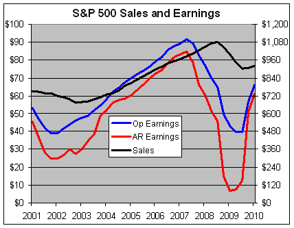
This chart shows the trailing four-quarter sales and earnings for the S&P 500. This needs a little explanation. The black line is the sales for the S&P 500 and it follows the right axis. The blue line represents the operating earnings and the red is the as-reported earnings. Both of those lines follow the left axis. Notice that sales are much less volatile than profits.
I’ve scaled the two axes at a ratio of 12-to-1, which means whenever the red or blue line crosses the black line, the profit margin is exactly 8.33%. Unfortunately, the data only goes up to the first quarter of this year, but nonetheless, I still think it gets the point across.
Let me explain the difference between the red and blue lines. The as-reported figure refers to simply the bottom line that companies report each quarter. The blue line is the earnings number that’s adjusted for special items. Personally, I prefer to look at operating earnings because the market has historically been more closely correlated to it. Some analysts only look at as-reported earnings and I respect that choice. You can use either but just be aware of the pitfalls of either choice.
The problem with as-reported earnings is that they can fall off a cliff as they did during the fourth quarter of 2008. AIG, for example, reported an earnings loss of over $280 a share. When all those financial stocks reported monster losses it gave the impression that the entire market was worthless. The red line plunged to nearly nothing. The market, obviously, didn’t put a standard multiple on $7 of trailing earnings. Instead, the market’s behavior followed the blue line. I’ll skip the accounting debates. My view is that if market thinks the blue line is important, then I think it’s important.
The problem with the operating earnings, however, is that it can reflect poor “earnings quality,” meaning companies get creative with their accounting. A good warning sign of poor earnings quality is when there’s a big gap between the red and blue lines. This was a bigger issue a few years ago, but I’m not so concerned about it today.
Either way, let’s not get bogged down on the issue of operating versus as-reported. The important point I want to get across to new investors is that the market has responded to a dramatic upsurge in operating earnings since March 2009. That’s great news. The problem is that companies haven’t grown their profits by generating new business. Instead, they’ve grown their profits by increasing profits margins. And they’ve done that by cutting costs, principally labor costs. They’ve fired and laid off their way to prosperity!
Basic economics tells us that profits can only go so far without sales growth and that’s been dismal, and it’s partly due to all those lay offs. That black line needs to get moving. The Q2 data point isn’t up yet but it will show pretty much the same thing, sluggish sales growth.
I scaled the two lines at 12-to-1 because once the blue line passes the black line (meaning, the overall profit margin exceeds 8.33%), that’s usually when the economy starts hitting the breaking point. When you can’t increase sales quickly, you need to grow earnings by raising prices. But when you increase margins, you slow sales growth. Hence, the economy moves in a cycle. Notice how the blue line tends to lead the black line by a year or two.
In other words, profits generate sales. But this time around, it just doesn’t seem to be working. -
The Larger the Fund, the Fewer the Stocks
Posted by Eddy Elfenbein on August 25th, 2010 at 3:20 pmOne of the important lessons of investing is that individual investors often have an advantage over professionals. They don’t have to meet quarterly goals. They don’t have to justify their actions to committees.
Another is that as mutual funds get larger, it’s harder for them to make nimble investments. Consider these words from Jack Bogle:Jack Bogle shows how the investable universe of stocks declines sharply as a function of fund size. Assuming that a fund can hold no more than 5 percent of the outstanding shares of any company, Bogle estimates that a fund with $1 billion of assets can choose from over 1,900 stocks while a fund with $20 billion has a universe of about 250 stocks. So it happens that success can sow the seeds of its own failure.
True dat. This comes from an interesting report from Michael Mauboussin at Legg Mason (via Abnormal Returns). Of course, large mutual funds can invest in smaller stocks but those stocks play a much smaller role in the fund’s overall performance. It doesn’t take much to build a portfolio that’s nearly blind to moves of the overall market.
What really hurts individual investors is time horizon. While stocks have done better in the long run, that long run can indeed be a very, very long time. -
The Dow Breaks 10,000
Posted by Eddy Elfenbein on August 25th, 2010 at 2:54 pmThe Dow dipped below 10,000 this morning but thanks to an afternoon rally, we’re above 10,000. It seems like it was only 11-1/2 years ago that I saw that happen before.
-
Is 2010 Like 1982?
Posted by Eddy Elfenbein on August 25th, 2010 at 12:51 pmOn Friday, the government will revise the Q2 GDP numbers and I don’t think it will be very good. With a little over two months until election day, some folks are comparing this year’s contest to Ronald Reagan’s first mid-term election in 1982.
Here’s how the economy looked back then compared to today.

The red line shows the GDP’s performance from March 1980 to December 1982. The blue is from March 2008 to June 2010.
The comparison isn’t very apt. You can see the economy actually recovered in 1981 before falling again in 1982. That probably hurt Reagan in 1982 but the later recovery certainly helped him in 1984.
This time, the economy slumped into 2009 and has so far had a very unimpressive recovery in 2010.
- Load More
Does anyone have a suit of armor, jet skis and a blowtorch I can borrow/rent? There's an experiment I'm working on.
This is pretty amazing. US elections combined since 1924:
GOP: 1,058,301,749
DEM: 1,057,846,951
Oth: 88,548,252Unemployment spikes in Washington, DC
-
-
Archives
- April 2025
- March 2025
- February 2025
- January 2025
- December 2024
- November 2024
- October 2024
- September 2024
- August 2024
- July 2024
- June 2024
- May 2024
- April 2024
- March 2024
- February 2024
- January 2024
- December 2023
- November 2023
- October 2023
- September 2023
- August 2023
- July 2023
- June 2023
- May 2023
- April 2023
- March 2023
- February 2023
- January 2023
- December 2022
- November 2022
- October 2022
- September 2022
- August 2022
- July 2022
- June 2022
- May 2022
- April 2022
- March 2022
- February 2022
- January 2022
- December 2021
- November 2021
- October 2021
- September 2021
- August 2021
- July 2021
- June 2021
- May 2021
- April 2021
- March 2021
- February 2021
- January 2021
- December 2020
- November 2020
- October 2020
- September 2020
- August 2020
- July 2020
- June 2020
- May 2020
- April 2020
- March 2020
- February 2020
- January 2020
- December 2019
- November 2019
- October 2019
- September 2019
- August 2019
- July 2019
- June 2019
- May 2019
- April 2019
- March 2019
- February 2019
- January 2019
- December 2018
- November 2018
- October 2018
- September 2018
- August 2018
- July 2018
- June 2018
- May 2018
- April 2018
- March 2018
- February 2018
- January 2018
- December 2017
- November 2017
- October 2017
- September 2017
- August 2017
- July 2017
- June 2017
- May 2017
- April 2017
- March 2017
- February 2017
- January 2017
- December 2016
- November 2016
- October 2016
- September 2016
- August 2016
- July 2016
- June 2016
- May 2016
- April 2016
- March 2016
- February 2016
- January 2016
- December 2015
- November 2015
- October 2015
- September 2015
- August 2015
- July 2015
- June 2015
- May 2015
- April 2015
- March 2015
- February 2015
- January 2015
- December 2014
- November 2014
- October 2014
- September 2014
- August 2014
- July 2014
- June 2014
- May 2014
- April 2014
- March 2014
- February 2014
- January 2014
- December 2013
- November 2013
- October 2013
- September 2013
- August 2013
- July 2013
- June 2013
- May 2013
- April 2013
- March 2013
- February 2013
- January 2013
- December 2012
- November 2012
- October 2012
- September 2012
- August 2012
- July 2012
- June 2012
- May 2012
- April 2012
- March 2012
- February 2012
- January 2012
- December 2011
- November 2011
- October 2011
- September 2011
- August 2011
- July 2011
- June 2011
- May 2011
- April 2011
- March 2011
- February 2011
- January 2011
- December 2010
- November 2010
- October 2010
- September 2010
- August 2010
- July 2010
- June 2010
- May 2010
- April 2010
- March 2010
- February 2010
- January 2010
- December 2009
- November 2009
- October 2009
- September 2009
- August 2009
- July 2009
- June 2009
- May 2009
- April 2009
- March 2009
- February 2009
- January 2009
- December 2008
- November 2008
- October 2008
- September 2008
- August 2008
- July 2008
- June 2008
- May 2008
- April 2008
- March 2008
- February 2008
- January 2008
- December 2007
- November 2007
- October 2007
- September 2007
- August 2007
- July 2007
- June 2007
- May 2007
- April 2007
- March 2007
- February 2007
- January 2007
- December 2006
- November 2006
- October 2006
- September 2006
- August 2006
- July 2006
- June 2006
- May 2006
- April 2006
- March 2006
- February 2006
- January 2006
- December 2005
- November 2005
- October 2005
- September 2005
- August 2005
- July 2005
 Eddy Elfenbein is a Washington, DC-based speaker, portfolio manager and editor of the blog Crossing Wall Street. His