-
From 1999: Smart Money’s “Ten Stocks for the Next Decade”
Posted by Eddy Elfenbein on December 30th, 2009 at 2:00 pmNot looking so good.
Inktomi (INKT)
Red Hat (RHAT)
Scientific-Atlanta (SFA)
America Online (AOL)
Broadcom (BRCM)
Nokia (NOK)
Nortel Networks (NT)
MCI WorldCom (WCOM)
Monsanto (MON)
Citigroup (C) -
What the Steep Yield Curve Means for Stocks
Posted by Eddy Elfenbein on December 30th, 2009 at 10:52 amBespoke Investment Research notes the unusually steep yield curve. In fact, it’s close to the steepest curve on record. The only other time the curve was wider was in August 1982 when the stock market took off.
A few years ago, I looked at the impact of the yield curve on stock prices. The effect is pretty dramatic. Over a 45-year period, all of the S&P 500’s capital gain took place when the the 10-year note was higher than the 3-month T-bill by 65 or more basis points. That’s about 70% of the time. For the other 30% of the time, the market was flat. Today, the spread is about 380 points. -
This Is the Last Time I’ll Wear My Niners’ Jersey in Philly
Posted by Eddy Elfenbein on December 29th, 2009 at 11:40 am -
The 10 Interception Limit
Posted by Eddy Elfenbein on December 28th, 2009 at 7:20 pmWhat is it about 11 interceptions? Since 1981, no defensive back has made it to 11 inceptions in one season even though 11 different players have made it to 10. Another 28 players have made it to nine, including three this year. You can add another 45 players who have made it to eight. Talk about thin tails, this data set seems to have no tail at all.
-
Tiger Woods Destroyed $12 Billion in Market Value
Posted by Eddy Elfenbein on December 28th, 2009 at 2:51 pmIf academics say it, then it must be true:
More difficult to determine, though, is how the scandal would hit his corporate sponsors. So Victor Stango and Christopher Knittel, two economic professors at University of California, Davis, decided to take a stab at quantifyiung the effect–performing what is called an “event study.” To do this, the professors looked at the nine sponsors for which stock price data was available and compared stock returns for those companies for the 13 days after the accident, both to the entire stock market and a group of competitors. The market value of the sponsors fell 2.3%.
The ones hit the hardest? The three sports-related companies–Gatorade (owned by PepsiCo), Nike and Electronic Arts. Those companies experienced a 4.3% decline in stock value. Meanwhile, consulting firm Accenture “experienced no ill effects.”
Overall, the pace of the losses slowed by Dec. 11, the day Woods announced he would take a leave from golf, but as of Dec. 17, shareholders had not recovered their losses, according to the study. -
The Perils of Economic Stats
Posted by Eddy Elfenbein on December 28th, 2009 at 1:25 pmComing on the heels of Robert Shiller’s idea for securities based on national GDP, consider the problem of constant revisions. GDP growth for the third quarter of 1983 has been revised ten times, including once this year.
-
CEO Pay Is Negatively Correlated to Share Performance
Posted by Eddy Elfenbein on December 28th, 2009 at 10:48 amI can’t say this is much of a surprise:
It turns out that the bigger the CEO’s slice of the pie, the lower the company’s future profitability and market valuation. “These CEOs,” says Prof. Bebchuk, “seem to be trying to grab more than they should.”
Finance professor Raghavendra Rau of Purdue University and two colleagues looked at CEO pay and stock returns for roughly 1,500 companies per year from 1994 through 2006. They found that the 10% of firms with the highest-paid CEOs produce stock returns that lag their industry peers by more than 12 percentage points, cumulatively, over the next five years.
Companies at the top of the pay pile, Prof. Rau concluded, award their CEOs an annual average of $23 million—but leave their shareholders poorer (relative to other companies in the same industry) by an average of $2.4 billion per year. Each dollar that goes into the CEO’s pocket takes $100 out of shareholders’ pockets. -
The Decade In One Graph
Posted by Eddy Elfenbein on December 28th, 2009 at 12:24 amHere’s the decade version of the chart I posted last week.
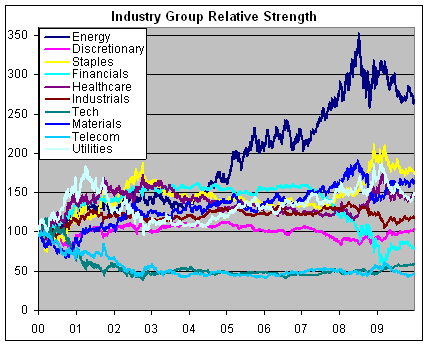
This is the relative strength of ten S&P industry groups set to 100 ten years ago. The big winner has been energy. Interestingly, financials were in the lead until mid-2004. -
Did the Immigration Protests Burst the Housing Bubble?
Posted by Eddy Elfenbein on December 27th, 2009 at 10:47 pmSteve Sailer has often called the recession the “diversity recession” due to the concentration of the subprime mortgage market within minority homeowners. The numbers are hard to come by, but the figures that do exist support much of what Steve has said.
I was curious to see what happened at the peak of the housing market and it seems to have coincided with many of the immigration reform protests in the spring of 2006. The largest events were the mass rallies on April 10 and the Day Without An Immigrant on May 1. There were also many other rallies in March and April (here’s a rundown).
Here’s a look at peak price dates for the 20 different metro areas in the Case-Shiller Index. These are the seasonally adjusted numbers. I also included how much the index is down from the peak price to the most recent data point.
Metro…………………………….Peak…………………………..Decline
Boston…………………………..Nov-05……………………….-15.2%
Cleveland……………………….Jan-06……………………….-15.5%
San Francisco………………….Feb-06……………………….-39.5%
Detroit……………………………Feb-06……………………….-44.0%
San Diego……………………….Mar-06……………………….-39.3%
Denver……………………………Mar-06……………………….-8.5%
Washington…………………….Mar-06……………………….-29.2%
Phoenix………………………….Apr-06………………………..-52.6%
Los Angeles…………………….Apr-06……………………….-39.4%
Minneapolis……………………..Apr-06……………………….-29.2%
Las Vegas……………………….Apr-06……………………….-56.1%
Tampa…………………………….May-06……………………….-40.8%
New York…………………………May-06……………………….-19.5%
Miami………………………………Dec-06……………………….-46.6%
Chicago…………………………..Feb-07……………………….-22.8%
Atlanta…………………………….Apr-07……………………….-19.0%
Dallas………………………………Apr-07……………………….-5.3%
Portland…………………………..May-07……………………….-20.2%
Seattle…………………………….May-07……………………….-22.8%
Charlotte………………………….Aug-07……………………….-11.5%
Eleven of the 20 markets peaked between February and May 2006. I’m not saying that the immigration protests caused the housing bubble. That was forming for a long time. The bursting of the bubble’s was long overdue and perhaps the dislocation in the housing sector brought on by the protests impacted the markets. Then, once the slide started, it couldn’t be stopped.
This evidence is very circumstantial but I think the hypothesis has merit. As they say, more research is needed. -
Sunday Links
Posted by Eddy Elfenbein on December 27th, 2009 at 5:54 pmHere are a few items I’m reading.
William Voegeli on the disaster that is California
Phil Birnbaum on the performance of pitchers.
Dave Barry’s brilliant take on the year 2009.
James Altucher comes out against homeownership.
Kid Dynamite on mean-reversion and momentum investing.
Finally, here’s the 2010 Bespoke Roundtable which I participated in.
- Tweets by @EddyElfenbein
-
-
Archives
- September 2024
- August 2024
- July 2024
- June 2024
- May 2024
- April 2024
- March 2024
- February 2024
- January 2024
- December 2023
- November 2023
- October 2023
- September 2023
- August 2023
- July 2023
- June 2023
- May 2023
- April 2023
- March 2023
- February 2023
- January 2023
- December 2022
- November 2022
- October 2022
- September 2022
- August 2022
- July 2022
- June 2022
- May 2022
- April 2022
- March 2022
- February 2022
- January 2022
- December 2021
- November 2021
- October 2021
- September 2021
- August 2021
- July 2021
- June 2021
- May 2021
- April 2021
- March 2021
- February 2021
- January 2021
- December 2020
- November 2020
- October 2020
- September 2020
- August 2020
- July 2020
- June 2020
- May 2020
- April 2020
- March 2020
- February 2020
- January 2020
- December 2019
- November 2019
- October 2019
- September 2019
- August 2019
- July 2019
- June 2019
- May 2019
- April 2019
- March 2019
- February 2019
- January 2019
- December 2018
- November 2018
- October 2018
- September 2018
- August 2018
- July 2018
- June 2018
- May 2018
- April 2018
- March 2018
- February 2018
- January 2018
- December 2017
- November 2017
- October 2017
- September 2017
- August 2017
- July 2017
- June 2017
- May 2017
- April 2017
- March 2017
- February 2017
- January 2017
- December 2016
- November 2016
- October 2016
- September 2016
- August 2016
- July 2016
- June 2016
- May 2016
- April 2016
- March 2016
- February 2016
- January 2016
- December 2015
- November 2015
- October 2015
- September 2015
- August 2015
- July 2015
- June 2015
- May 2015
- April 2015
- March 2015
- February 2015
- January 2015
- December 2014
- November 2014
- October 2014
- September 2014
- August 2014
- July 2014
- June 2014
- May 2014
- April 2014
- March 2014
- February 2014
- January 2014
- December 2013
- November 2013
- October 2013
- September 2013
- August 2013
- July 2013
- June 2013
- May 2013
- April 2013
- March 2013
- February 2013
- January 2013
- December 2012
- November 2012
- October 2012
- September 2012
- August 2012
- July 2012
- June 2012
- May 2012
- April 2012
- March 2012
- February 2012
- January 2012
- December 2011
- November 2011
- October 2011
- September 2011
- August 2011
- July 2011
- June 2011
- May 2011
- April 2011
- March 2011
- February 2011
- January 2011
- December 2010
- November 2010
- October 2010
- September 2010
- August 2010
- July 2010
- June 2010
- May 2010
- April 2010
- March 2010
- February 2010
- January 2010
- December 2009
- November 2009
- October 2009
- September 2009
- August 2009
- July 2009
- June 2009
- May 2009
- April 2009
- March 2009
- February 2009
- January 2009
- December 2008
- November 2008
- October 2008
- September 2008
- August 2008
- July 2008
- June 2008
- May 2008
- April 2008
- March 2008
- February 2008
- January 2008
- December 2007
- November 2007
- October 2007
- September 2007
- August 2007
- July 2007
- June 2007
- May 2007
- April 2007
- March 2007
- February 2007
- January 2007
- December 2006
- November 2006
- October 2006
- September 2006
- August 2006
- July 2006
- June 2006
- May 2006
- April 2006
- March 2006
- February 2006
- January 2006
- December 2005
- November 2005
- October 2005
- September 2005
- August 2005
- July 2005
 Eddy Elfenbein is a Washington, DC-based speaker, portfolio manager and editor of the blog Crossing Wall Street. His